Uncategorized

Best Rug Colours for Small or Dark Rooms

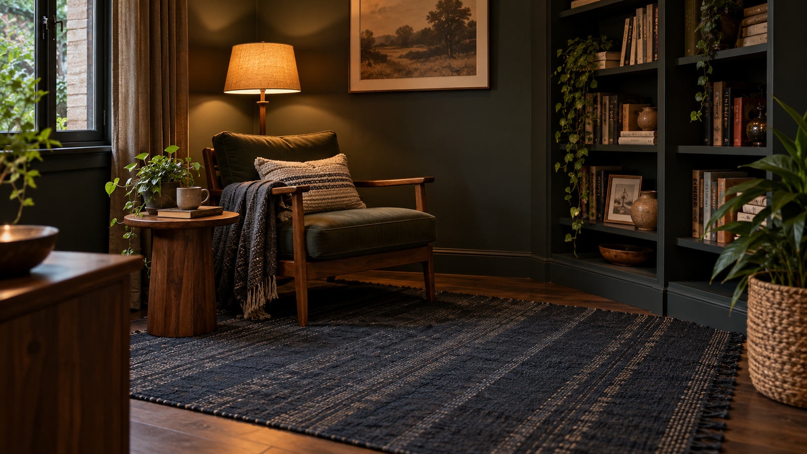
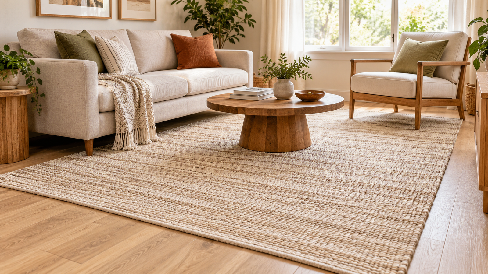
Darker-toned dhurrie rug working well in a small room with a cohesive moody colour palette

The honest answer to best rug colours for small or dark rooms is more nuanced than "always go light," even though that's what most guides tell you. Light colours genuinely do help, they reflect available light rather than absorbing it, which is useful in both a small room and a dark one. But the deeper principle, the one that actually explains why light works when it does, is about contrast rather than lightness on its own. A rug that blends closely with your floor tends to make a room feel bigger regardless of exactly how light or dark that shade is, and a stark white rug against a very dark floor can create more visual interruption, not less. This guide covers the full picture rather than the oversimplified version.

Table of Contents

Why Light Colours Generally Work

Light colours reflect more of the light already in a room rather than absorbing it, which is genuinely useful in two different situations. A small room benefits because reflected light reduces the sense of visual weight sitting on the floor. A dark room, one with limited windows or north-facing light regardless of its actual size, benefits because there's less natural light to work with in the first place, so every surface that bounces it back rather than soaking it up helps.

Ivory, oatmeal, soft grey, pale sage and other muted neutrals are the reliable starting point for both situations. This happens to align naturally with how Zorwaa's natural fibres already look undyed, raw wool and cotton sit in exactly this tonal range before any colour is added, part of why our natural fibre rugs tend to read as calm and light-filling rather than heavy, even in a deeper accent shade.

The Part Most Colour Guides Skip: Contrast Matters More Than Lightness Alone

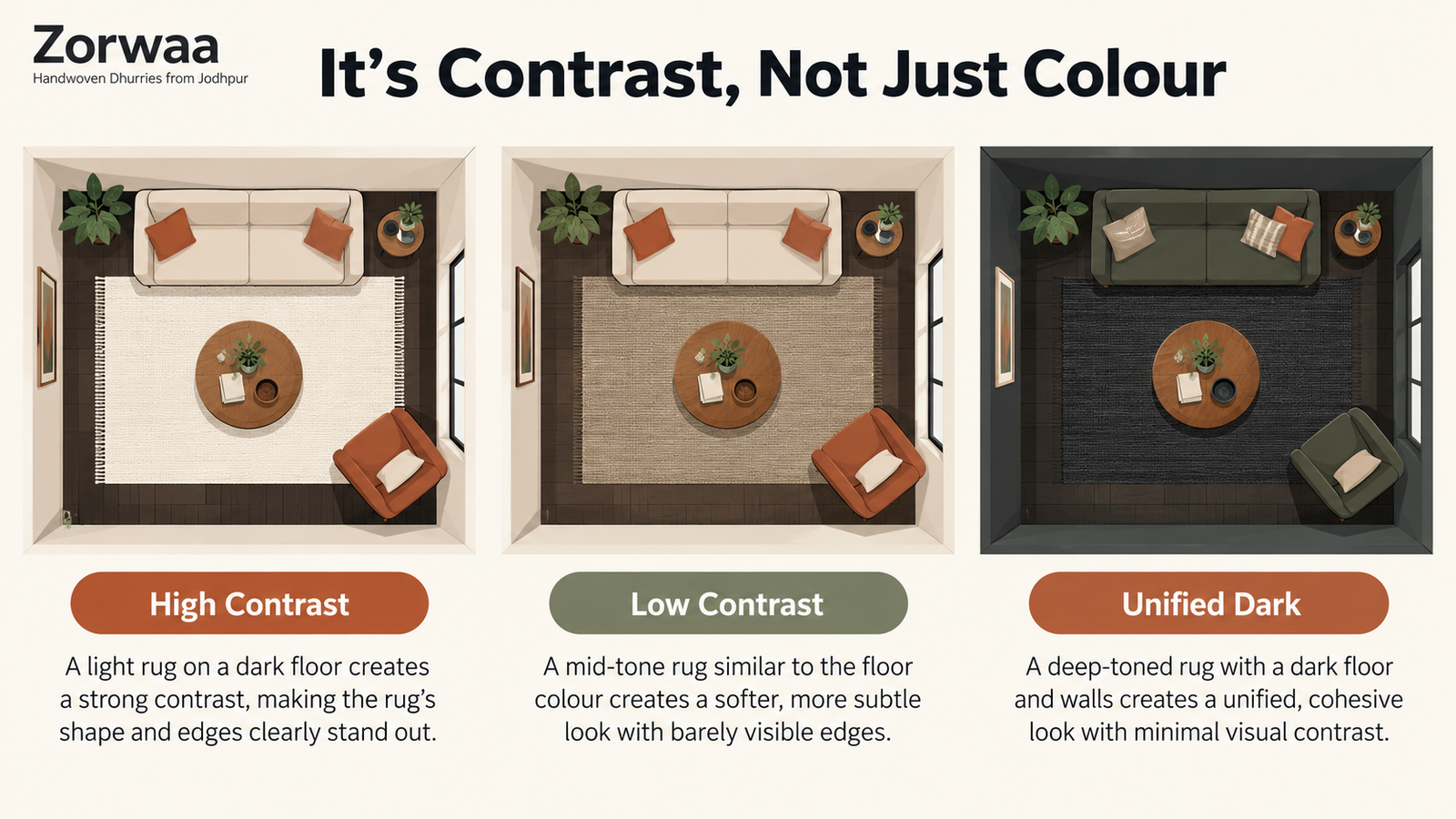
Here's what most colour advice leaves out. The real mechanism behind a rug making a room feel bigger isn't lightness by itself, it's how much contrast sits between the rug and the floor around it. A rug that's noticeably lighter or darker than the floor creates a visible edge, a line where the eye registers "rug stops here, floor starts," and that line is what actually breaks up the sense of continuous space.

This is why a stark white rug on a very dark floor doesn't always deliver the spacious effect people expect, the contrast between the two is often sharper than a well-chosen mid-tone that sits closer to the floor's own colour. There's no strict rule that a rug needs to be lighter than the floor, a slightly darker rug can actually read as more cohesive against a dark floor than a bright white one does, while still avoiding the heaviness of a true match in a very deep tone.

The practical takeaway: look at your floor colour first, then choose a rug that sits close to it in tone, rather than defaulting to the lightest option on the shelf regardless of what's underneath it.

Pattern And Scale Matter As Much As Colour

A busy, high-contrast pattern works against a small room even in otherwise good colours, since a lot of competing shapes gives the eye too many places to land, which reads as visual clutter rather than openness. Small, subtle, low-contrast patterns, a faint stripe, a tone-on-tone geometric repeat, do the opposite, adding texture without giving the eye a reason to stop and process a busy design.

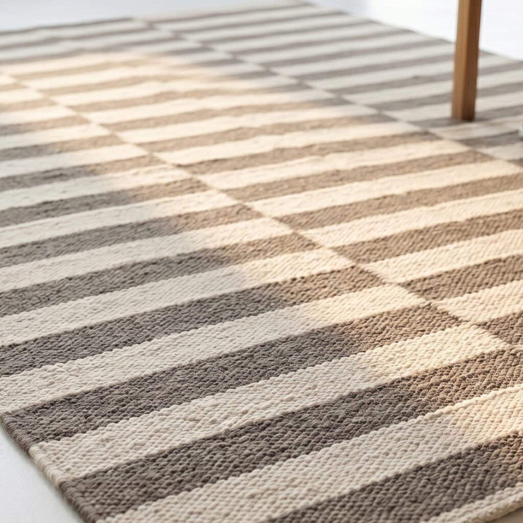
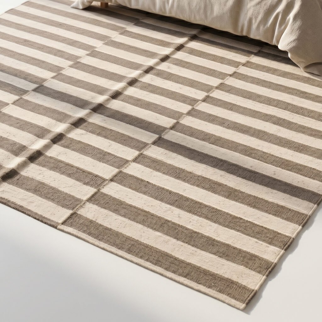
Stripes specifically can do real work here. A rug with stripes running the long way through a narrow room can make it read as longer and more open, the same logic as a vertically striped wall making a room feel taller. The scale matters more than the exact pattern, a small, quiet repeat reads as texture, a large, bold one reads as a floor full of furniture you didn't buy.

Light ivory flatweave dhurrie rug in a small room with low contrast against the floor

When A Darker Rug Actually Works Better

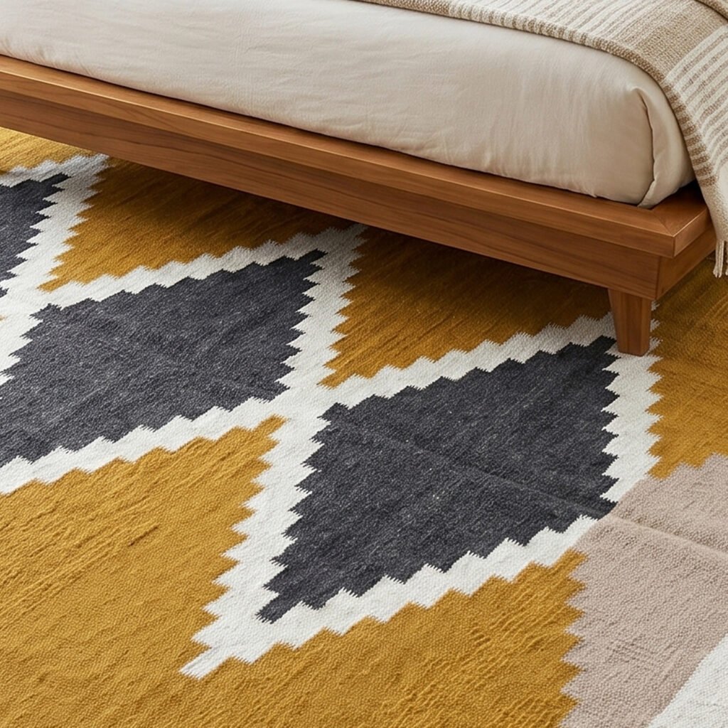
Light isn't always the right call, and it's worth saying so plainly. A darker rug can genuinely ground a small room rather than shrink it, particularly one with a deliberately moody palette already, dark walls, warm low lighting, richer furniture tones. In that context, a light rug actually reads as the odd one out, the one element fighting the room's established mood rather than supporting it.

The difference between a dark rug that works and one that doesn't usually comes down to whether the rest of the room commits to the same idea. A dark rug in an otherwise bright, light-walled room reads as a heavy anchor weighing the space down. A dark rug inside a room that's already built around deeper tones reads as part of a considered, unified palette instead. Match the rug to the room's actual commitment to light or dark, not to a rule that applies regardless of context.

Getting The Size Right Matters Just As Much As The Colour

No colour choice fixes a rug that's the wrong size for the room. A small rug that floats in the middle of the floor chops the space into disconnected sections regardless of how well you've chosen its shade, which undoes most of the work a good colour choice was doing in the first place. Our rug size guide covers the sizing side properly, worth reading alongside this one rather than treating colour and size as separate decisions, since a well-sized rug in a mediocre colour usually reads better than a perfectly chosen colour in the wrong size.

Products You May Like

-51%
Select options This product has multiple variants. The options may be chosen on the product page

Modern Wool Flatweave Rug Beige & Brown | Neutral Handmade Area Rug

₹2,399.00 ₹43,200.00Price range: ₹2,399.00 through ₹43,200.00
-51%
Select options This product has multiple variants. The options may be chosen on the product page

Handmade Wool Area Rug Yellow | Scandinavian Flatweave Dhurrie Rug

₹2,399.00 ₹43,200.00Price range: ₹2,399.00 through ₹43,200.00
-50%
Select options This product has multiple variants. The options may be chosen on the product page

Master-Stroke Panja Weave: Heritage Reversible Dhurrie

₹3,800.00 ₹64,800.00Price range: ₹3,800.00 through ₹64,800.00
-50%
Select options This product has multiple variants. The options may be chosen on the product page

Handwoven Cotton Panja Dhurrie Rug for Living Room, Reversible Flatweave Indoor Outdoor

₹3,800.00 ₹64,800.00Price range: ₹3,800.00 through ₹64,800.00
Quick Colour Decision Checklist

  • Light neutrals are the safest default for both small and dark rooms, since they reflect available light
  • Contrast with your floor colour matters more than lightness alone, aim for the rug to sit close in tone to the floor beneath it
  • Small, low-contrast patterns read as texture, large bold patterns read as clutter in a small room
  • A darker rug can work well in a room already committed to a moody, deeper palette
  • Stripes running the long way through a narrow room can make it feel longer
  • Get the size right first, no colour choice fixes a rug that's the wrong size for the room
Zorwaa infographic showing how rug and floor contrast affects how spacious a small room feels

Frequently Asked Questions

Light neutrals, ivory, oatmeal, soft grey, generally work best, but the deeper principle is low contrast with your floor colour, not lightness alone.

There’s no strict rule. A rug close in tone to the floor, whether lighter or slightly darker, usually creates a more open feel than a rug with high contrast against the floor, even a light one.

Yes, if the rest of the room commits to a similarly deep, moody palette. A dark rug in an otherwise bright room tends to read as a heavy anchor rather than a considered choice.

Small, subtle, low-contrast patterns work better than large bold ones, which can make a small space feel cluttered rather than textured.

The safest colour for a small or dark room is still a light, muted neutral, but the better question is how closely your rug relates to the floor and the rest of the room around it. Match tone before you match lightness, and get the size right before either. Browse our solid colour collection for the tonal neutrals that do this work well, or our traditional collection for subtle, low-contrast pattern options.